In today’s digital age, visual content has become a powerful tool for brands and businesses to communicate with their audience. Whether you are designing a social media post, a website, or marketing materials, it is essential to create content that is visually appealing and captures the attention of your viewers. In this article, we will explore five graphic design tricks that will help you create irresistible visual content that stands out from the crowd.
- The Power of Color
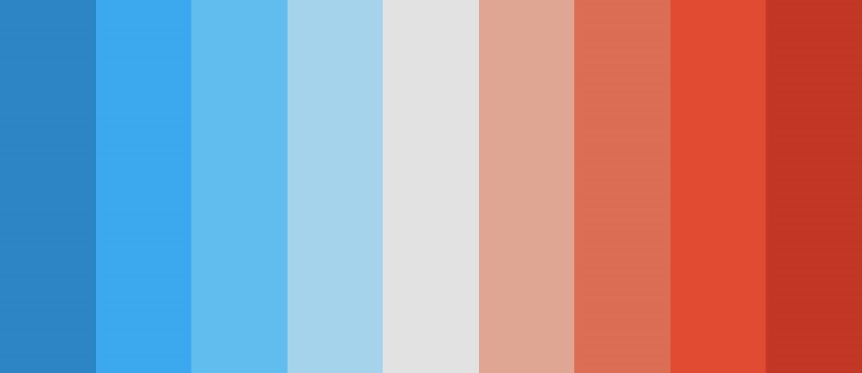
Color plays a significant role in capturing the attention of your audience and evoking emotions. Understanding color theory can help you create visually harmonious designs that resonate with your viewers. Each color has its own psychological impact.
For example, warm colors like red, orange, and yellow evoke feelings of energy and enthusiasm, while cool colors like blue and green create a sense of calmness and tranquility. By using the right color combinations, you can create a visual experience that elicits the desired emotional response from your audience.
It is important to pay attention to color contrast as well. Using contrasting colors can make your design elements stand out and create a dynamic visual impact. On the other hand, using similar colors can create a harmonious and cohesive look. Experiment with different color palettes to find the perfect combination that resonates with your brand and captivates your audience.
- Typography Matters
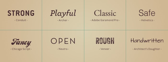
Typography is more than just choosing a font. It is about using different fonts, sizes, and styles to create hierarchy and communicate your message effectively. When selecting fonts for your visual content, consider your brand personality and the emotions you want to evoke.
Start by choosing a font that matches your brand identity. Is your brand modern and sleek or fun and playful? Different font styles can convey different moods and attitudes. Once you have chosen your primary font, experiment with varying font sizes and weights to create visual hierarchy. This will guide the viewer’s eyes and emphasize the most important elements of your design.
While it’s great to experiment with different fonts and styles, try not to go overboard. Stick to a limited number of fonts per design to maintain consistency and readability. Do not use too many fonts otherwise it make your design look cluttered and confusing.
- Balance and Composition
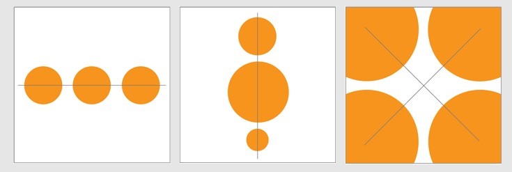
Creating a balanced composition is vital for visual content. It ensures that your designs are visually pleasing and easy to digest. Symmetrical balance creates a sense of stability and order. It involves arranging elements evenly and mirroring them on either side of a central axis. Symmetry can give your design a formal and traditional look.
On the other hand, asymmetrical balance brings a sense of dynamism and modernity. It involves arranging elements in an unbalanced yet visually pleasing manner. This type of balance can create intrigue and capture attention.
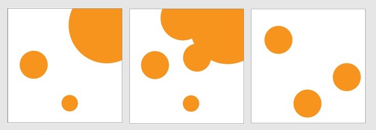
Experiment with different layouts and placements of elements to find the perfect balance for your designs. Consider the content and message you want to convey and choose a composition that enhances those elements.
- Negative Space is Your Friend
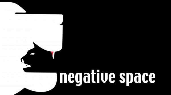
Negative space, also known as white space, is the empty space surrounding your design elements. Many designers underestimate the power of negative space, but it plays a crucial role in aesthetics and usability.
Incorporating enough negative space in your designs creates breathing room and allows the viewer’s eyes to rest. It also helps to highlight the important elements of your design and create a clean and polished look. Don’t be afraid to let your design breathe!
Negative space can be used strategically to create emphasis and enhance visual hierarchy. By leaving more space around important elements, you can draw attention and guide the viewer’s eyes to where you want them to focus.
- Use Visual Hierarchy
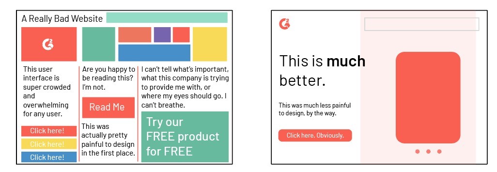
Visual hierarchy is about organizing elements in a way that guides the viewer’s attention and creates a clear flow. It ensures that your audience sees and understands the most important information first.
There are several elements you can use to establish visual hierarchy in your designs. Size is one of the most effective ways to create emphasis. Larger elements tend to stand out more and catch the viewer’s eye. Use different font sizes, image sizes, and element sizes to create contrast and establish hierarchy.
Color contrast is another powerful tool for visual hierarchy. By using contrasting colors, you can make certain elements pop and draw attention. Experiment with color combinations to find the right balance of contrast and cohesion in your designs.
Placement and alignment also play a role in visual hierarchy. Elements placed at the top or left side of a design tend to be noticed first. Take advantage of this by strategically placing your most important elements in these areas.
Conclusion
By implementing these five graphic design tricks, you can create irresistible visual content that captures attention and engages viewers. Remember to experiment with different color palettes, fonts, compositions, and visual hierarchy techniques to find what works best for your brand. With practice and creativity, you’ll be able to create stunning visuals that leave a lasting impression on your audience.

