In the realm of creative design, color holds immense power. It has the ability to evoke emotions, convey messages, and captivate audiences. Whether you’re designing a website, creating a logo, or crafting a piece of artwork, selecting the right color combination is crucial. It can make or break your design, influencing how it’s perceived and remembered. In this guide, we’ll delve into the art of choosing color combinations in creative endeavors, exploring techniques and considerations that will help you master this essential aspect of design.
Understanding Color Theory:
Before diving into the process of selecting color combinations, it’s essential to have a basic understanding of color theory. Color theory provides a framework for understanding how colors interact and how they can be combined effectively. Here are some key concepts to keep in mind:
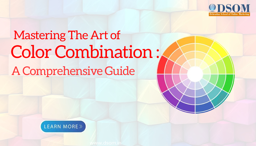
1.Color Wheel: The color wheel is a visual representation of the relationships between colors. It consists of primary colors (red, blue, yellow), secondary colors (orange, green, purple), and tertiary colors (the mix of primary and secondary colors). Understanding the relationships between these colors is fundamental to creating harmonious combinations.

2.Color Harmony: Harmony refers to the pleasing arrangement of colors in a design. There are several types of color harmony, including complementary (colors opposite each other on the color wheel), analogous (colors adjacent to each other on the color wheel), and triadic (three colors equidistant from each other on the color wheel). Each type of harmony creates a different visual effect and mood.

3.Color Psychology: Colors have psychological associations that can influence how they’re perceived. For example, red is often associated with passion and energy, while blue is associated with calmness and trust. Understanding these associations can help you choose colors that align with the message or mood you want to convey in your design.

Choosing Color Combinations:
Now that we have a foundation in color theory, let’s explore the process of choosing color combinations for creative projects. Here are some steps to follow:
- Define the Purpose and Audience: Before selecting colors, it’s essential to understand the purpose of your design and the audience you’re targeting. Is it a playful children’s website, a professional business logo, or a serene landscape painting? Consider the emotions and impressions you want to evoke in your audience.
- Research and Inspiration: Look for inspiration in various sources, such as nature, art, fashion, and design trends. Pay attention to color combinations used in successful designs and analyze why they work. Websites like Pinterest and design blogs can be valuable resources for finding inspiration.
- Experiment with Color Tools: There are many online tools and resources available to help you explore and experiment with color combinations. Websites like Adobe Color, Coolors, and Paletton allow you to create and preview color schemes quickly. Use these tools to generate ideas and refine your choices.
- Consider Context and Medium: Keep in mind the context in which your design will be used and the medium it will be presented in. Colors may appear differently on screen versus in print, so it’s essential to consider how they will translate across different mediums. Test your color combinations in various contexts to ensure they remain effective.
- Balance and Contrast: Aim for balance and contrast in your color combinations to create visual interest and hierarchy. Balance lighter and darker shades, warm and cool tones, and saturated and desaturated colors to achieve harmony in your design. Contrast can help certain elements stand out and draw attention where needed.
- Limit Your Palette: While it’s tempting to use a wide range of colors, limiting your palette to a few key hues can create a more cohesive and impactful design. Choose a primary color or two as the foundation of your palette, then add accent colors for variety and emphasis.
- Test and Iterate: Don’t be afraid to experiment and iterate on your color choices. Test different combinations and solicit feedback from peers or clients. Keep refining your design until you’re satisfied that the colors effectively convey the desired message and mood.

Conclusion:
Choosing the right color combination is a critical aspect of creative design. By understanding the principles of color theory, considering the purpose and audience of your design, and experimenting with different combinations, you can create visually compelling and impactful designs. Remember to stay open to inspiration, be mindful of context and medium, and strive for balance and harmony in your color choices. With practice and attention to detail, you’ll master the art of color combination and elevate your creative projects to new heights.


