In today’s mobile-first world, having a mobile-friendly website isn’t optional—it’s essential for success. With over half of all web traffic coming from smartphones, a site that frustrates users on small screens loses visitors, rankings, and revenue fast.
This guide covers everything you need to build and optimize a mobile-friendly website, from responsive design basics to advanced technical tweaks. We’ll address the most searched keywords around mobile optimization, including common pitfalls and proven strategies that deliver real results. Whether you’re a business owner, developer, or marketer, these insights will help you create seamless experiences that users love and search engines reward.
1. Understanding the Importance of a Mobile-Friendly Website
A mobile-friendly website adapts beautifully to phones, tablets, and desktops, ensuring fast loading, easy navigation, and readable content. Google uses mobile-first indexing, meaning it primarily evaluates the mobile version for rankings.
Ignoring this leads to poor user signals like high bounce rates and low dwell time. Businesses with mobile-friendly websites see higher engagement, better conversion rates, and stronger SEO performance.
Key statistic highlight: Over 60% of searches happen on mobile devices. A non-optimized site risks losing the majority of potential customers before they even explore your offerings.
Focusing on a mobile-friendly website builds trust and keeps visitors coming back. It’s one of the smartest investments for long-term digital growth.
2. Core Elements of Responsive Web Design
Responsive design is the foundation of any successful mobile-friendly website. It uses flexible grids, images, and media queries to adjust layout dynamically.
Essential components:
- Fluid layouts that scale with screen size.
- Flexible images that resize without distortion.
- CSS media queries to apply different styles based on device width.
Start with a mobile-first approach: Design for small screens first, then enhance for larger ones. This ensures your mobile-friendly website performs excellently on phones while scaling up effortlessly.
Pro Tip: Test early with real devices alongside emulators for accurate insights. Avoid common traps like fixed-width elements that break on smaller screens.
3. Optimizing Page Speed
Speed is critical for a mobile-friendly website. Users expect pages to load in under 3 seconds, or they leave. Slow mobile experiences hurt both UX and rankings.
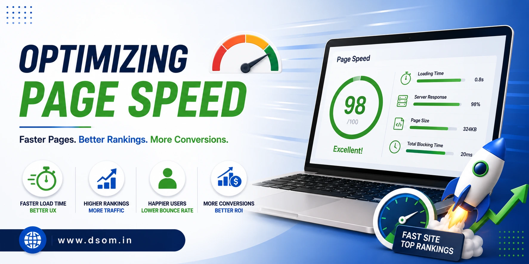
Powerful optimization techniques:
- Compress images and use modern formats like WebP.
- Minify CSS, JavaScript, and HTML.
- Enable browser caching and use a Content Delivery Network (CDN).
- Eliminate render-blocking resources.
Tools like Google PageSpeed Insights provide specific recommendations tailored for mobile. Aim for Core Web Vitals compliance—Largest Contentful Paint (LCP), Interaction to Next Paint (INP), and Cumulative Layout Shift (CLS) all matter hugely on mobile.
Highlighted important thing: Every second of delay can reduce conversions by 7% or more. Prioritizing speed turns your mobile-friendly website into a competitive advantage.
4. Mobile Navigation and Usability Best Practices
Clunky navigation destroys the experience on a mobile-friendly website. Touch-friendly menus, clear calls-to-action, and intuitive layouts keep users engaged.
Best practices include:
- Hamburger menus or bottom navigation for easy access.
- Large, tappable buttons with adequate spacing.
- Readable font sizes (minimum 16px for body text).
- Simplified forms with auto-fill and minimal fields.
Avoid hover effects that don’t work on touchscreens. Ensure critical information appears above the fold without excessive scrolling.
A well-designed mobile-friendly website guides users effortlessly toward goals like purchases or sign-ups. Test usability with real users for honest feedback. (Section ~150 words)
5. Technical SEO Factors
Technical setup plays a huge role in how search engines view your mobile-friendly website.
Must-do actions:
- Implement responsive design with a single URL (avoid separate mobile sites unless necessary).
- Use proper viewport meta tag: <meta name=”viewport” content=”width=device-width, initial-scale=1″>.
- Ensure Google can crawl and render your mobile content effectively.
- Fix mobile-specific issues like interstitial pop-ups that block content.
Submit your site to Google Search Console and monitor the Mobile Usability report for errors. Structured data (schema markup) enhances rich results across devices.
These technical foundations strengthen your mobile-friendly website and improve visibility in mobile search results.
6. Content Optimization for Mobile Users
Content on a mobile-friendly website must be scannable and valuable on small screens.
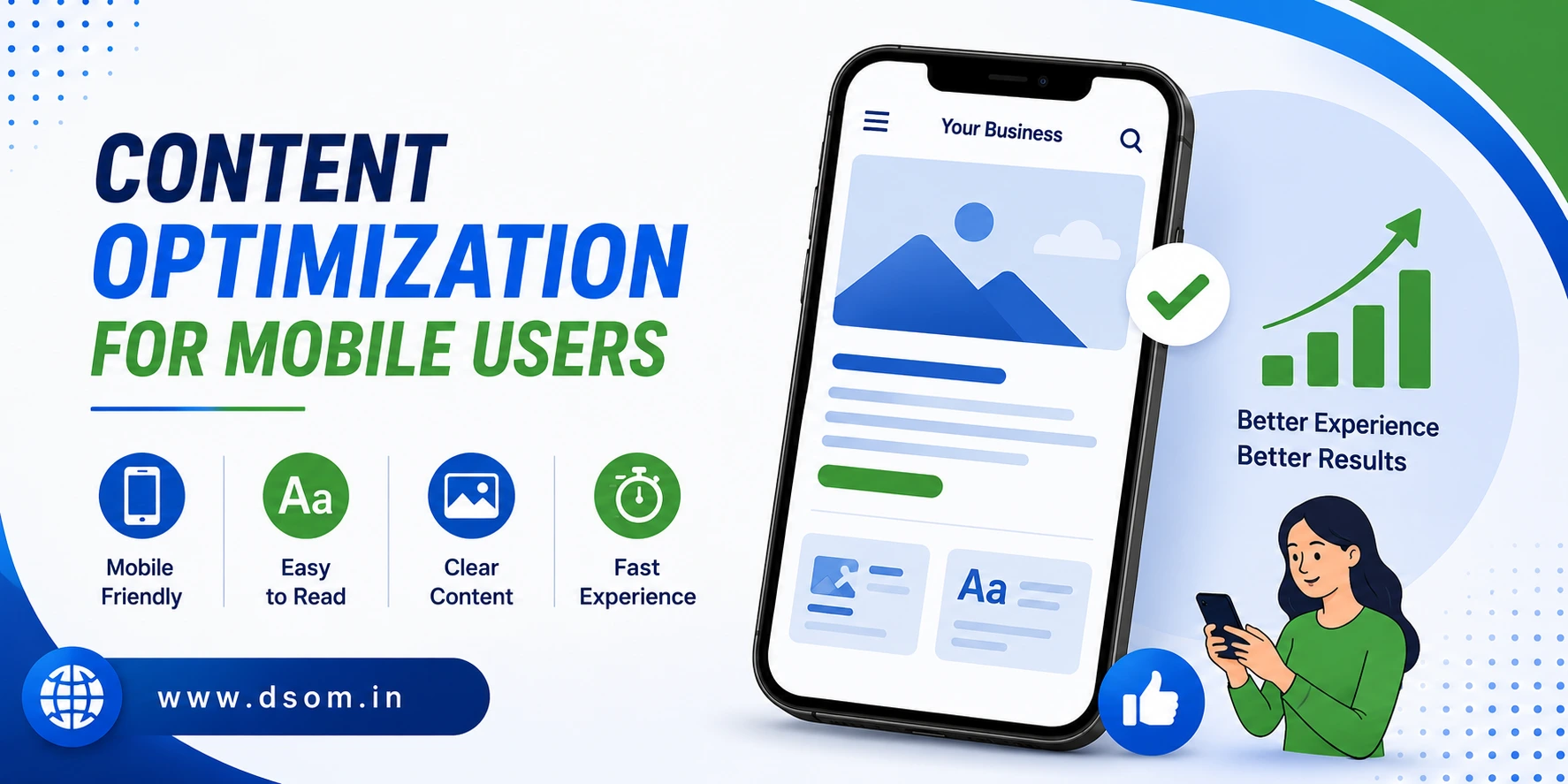
Effective strategies:
- Short paragraphs and plenty of white space.
- Descriptive subheadings and bullet points.
- High-quality images with optimized alt text.
- Videos that autoplay muted or load efficiently.
Focus on user intent—mobile visitors often seek quick answers or directions. Keep important information prominent. Regularly audit content performance on mobile analytics.
Keyword integration note: When creating content for your mobile-friendly website, use terms naturally to support both users and search engines.
7. Common Mistakes (and How to Avoid Them)
Many sites fail at mobile optimization due to preventable errors.
Frequent pitfalls:
- Non-responsive elements causing horizontal scrolling.
- Tiny text and buttons that are hard to tap.
- Slow-loading heavy resources.
- Pop-ups that cover the entire screen on mobile.
Table: Common Mobile Issues vs. Solutions
| Issue | Impact on Mobile-Friendly Website | Quick Fix |
|---|---|---|
| Fixed Width Layouts | Horizontal scrolling, frustration | Use percentage-based or flexible units |
| Small Tap Targets | High bounce rates | Minimum 48px touch targets |
| Unoptimized Images | Slow loading | Compress + lazy loading |
| Complex Navigation | Poor usability | Simplify menus, add search |
| Ignoring Core Web Vitals | Lower rankings | Optimize LCP, INP, CLS |
| Intrusive Pop-ups | Blocked content | Use non-intrusive formats |
8. Advanced Tips: AMP, PWA, and Future-Proofing
For competitive edges, consider Accelerated Mobile Pages (AMP) for lightning-fast content delivery or Progressive Web Apps (PWA) for app-like experiences without downloads.
PWAs offer offline functionality, push notifications, and home screen installation—ideal for engagement.
Stay ahead by monitoring emerging trends like better foldable device support and improved touch interactions. A forward-thinking mobile-friendly website adapts continuously.
Highlighted takeaway: Investing in advanced mobile features positions your site as a leader, boosting loyalty and conversions.
9. Testing and Monitoring Your Website
Continuous testing ensures ongoing excellence.
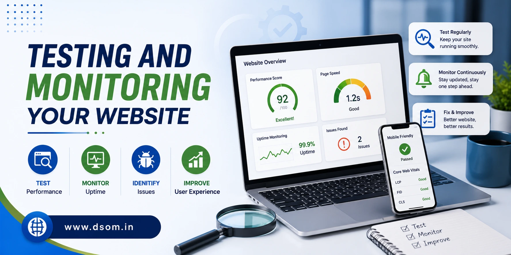
Recommended tools and methods:
- Google Mobile-Friendly Test and PageSpeed Insights.
- Browser developer tools for device emulation.
- Real-user testing services.
- Analytics to track mobile vs. desktop metrics.
Set up alerts for issues and review performance quarterly. A/B test layouts and features to find what resonates best with your audience.
Monitoring keeps your mobile-friendly website performing at its peak.
10. Measuring Success and ROI
Track key metrics: mobile traffic share, bounce rate, conversion rate, average session duration, and rankings for mobile searches.
Tools like Google Analytics provide device-specific insights. Businesses often see 20-50% improvements in key metrics after full mobile optimization.
Important highlight: A truly mobile-friendly website doesn’t just rank better—it drives real business results through satisfied users.
Step-by-Step Checklist for Mobile-Friendly Website
| Step | Action Items | Priority | Tools |
|---|---|---|---|
| 1 | Implement Responsive Design | Critical | CSS Media Queries |
| 2 | Optimize Images & Media | High | WebP, Lazy Load |
| 3 | Improve Navigation & UX | High | User Testing |
| 4 | Boost Page Speed | Critical | PageSpeed Insights |
| 5 | Fix Technical Issues | High | Search Console |
| 6 | Optimize Content | Medium | Scannability Audit |
| 7 | Test Across Devices | Ongoing | Emulators + Real Devices |
| 8 | Monitor & Iterate | Ongoing | Analytics |
Conclusion
Building a mobile-friendly website is one of the highest-ROI projects you can undertake. It improves user satisfaction, search visibility, and bottom-line results across devices. By addressing design, speed, navigation, technical factors, and content, you create experiences people love.
Avoid the common traps outlined here, test relentlessly, and keep user needs at the center. Learning the latest mobile optimization techniques through DSOM (Dehradun School of Online Marketing) can help you build websites that rank higher, load faster, and convert better in today’s competitive digital landscape.
Start implementing these strategies now—audit your current site, prioritize quick wins, and watch the positive impact unfold. A great mobile experience isn’t just nice to have; it’s what separates winners from the rest.